The Impact of Vibrant Colors in Interior Design.

The Impact
of Vibrant Colors in Interior Design.
I received a priority
request from Steve Clive who lives in South Africa. Steve is a big fan of
vibrant colors and firmly believes in the therapeutic benefits of color
therapy. He has reached out to me for some advice on how to add a pop of color
to his space without it looking too childish or overwhelming. Steve let's see
how I can help you out!
But before I continue with Steve’s
question, let me explain Chromotherapy, also known as color therapy. This
technique utilizes the visible spectrum of electromagnetic radiation to treat
various diseases and has been effectively used for centuries to cure a range of
illnesses. Here are some important things to know about chromotherapy:

The Historical Background:
Chromotherapy has been used in various cultures throughout history. For
instance, the ancient Egyptians worshipped the sun and employed colored
crystals for therapy. In India, Ayurvedic medicine has been using chromotherapy
for thousands of years.
Color and Emotion: Different colors
have varying impacts on the human body and mind. For instance, red is used to
stimulate the body and mind and to increase circulation. Yellow, on the other
hand, stimulates the nerves and purifies the body.
Application in Daily Life:
Chromotherapy can be implemented in our daily lives. For instance, the color of
your room can impact your mood and energy levels. Blue can make you feel calm
and relaxed, while orange can make you feel more energized.

And of course, The Scientific Basis:
Although chromotherapy is considered an alternative medicine, there is some
scientific evidence that supports the impact of color on mood and health.
Certain colors have been found to improve mood, reduce stress, or increase
performance levels.
Chromotherapy in Interior Design: In
interior design, understanding the effects of color can help create spaces that
foster desired emotions and behaviors. For instance, a vibrant red or orange
might be a good choice for a workout room, where high energy levels are
desired.
The Psychology of Color.
Color psychology is the study of how colors can influence human
behavior and decision-making processes. It’s a crucial concept in various
fields, including marketing, branding, and interior design. Here’s a brief
overview of how some colors are typically interpreted:
Red: This color is often
associated with energy, passion, and intensity. It can stimulate faster
heartbeats and breathing, making it a great choice for spaces where high energy
is desired.
Orange: Orange is a vibrant
and energetic color that can stimulate activity and encourage socialization.
It’s often used in spaces where lively interactions are encouraged.
Yellow: Known as the color of
happiness, optimism, and creativity, yellow can lift spirits and self-esteem.
It’s ideal for spaces where bright and sunny energy is desired.
Green: Green is often
associated with nature, tranquility, and health. It’s a restful color that can
encourage relaxation and calmness.
Blue: Blue is a color often
associated with peace, tranquility, and reliability. It can lower heart rate
and body temperature, making it ideal for relaxing and calming spaces.
Vibrant Colors in Action.
Incorporating vibrant colors into interior design can
dramatically change the energy and mood of a space.
Accent Walls: A single wall painted
in a vibrant color can become a focal point of the room, adding depth and
interest.
Furniture and Decor: Vibrant-colored
furniture or decor pieces can add a pop of color to a neutral space, making it livelier
and more interesting.
Color Blocking: This involves pairing
two or more vibrant colors together. It’s a bold and creative approach that can
add a lot of personality to a space.
Patterns and Prints: Vibrant colors can be
incorporated through patterns and prints on walls, furniture, or decor items.
This can add a fun and playful element to the space.
Keep in mind that while vibrant colors can energize a space,
balance is key. Too much of a vibrant color can be overwhelming, so it’s
important to balance it out with neutrals or softer shades.
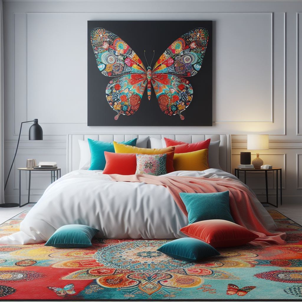
60-30-10 Rule.
The 60-30-10 rule is a well-known concept in visual design,
particularly in interior design. It's a proportion rule that helps to create a
balanced color scheme in any given space. Here's how it works:
60% - Dominant Color: This is usually the primary color of the
room, which is often a neutral or muted tone. It's the color that covers the
walls, large furniture pieces, and even the floor. This color sets the overall
tone of the room.
30% - Secondary Color: This color should contrast with the 60%
color. It's often a bit bolder and is used on smaller furniture, curtains,
bedding, and rugs. It's there to provide visual interest and break the monotony
of the dominant color.
10% - Accent Color: This is your chance to be bold and vibrant.
The accent color is used on decorative pieces like throw pillows, vases,
artwork, and other small accessories. This color brings life and character to
the room.
In a living room, you might have (60%) white walls, a matching
sofa, (30%) colorful curtains and a rug, and (10%) different vibrant colored
throw pillows and artwork.
The beauty of the 60-30-10 rule is its flexibility. You can
choose any colors you like, as long as they follow this proportion. It's a
simple yet effective way to create a balanced and harmonious color scheme in
any space.
The world of interior design is constantly evolving, and color trends are no exception. Here are some potential future color trends in interior design.

Bold, Vibrant Colors: As people become more
adventurous with their design choices, we can expect to see more bold, vibrant
colors being used. These colors can add personality and energy to a space,
making it feel more unique and personalized.
Colorful Kitchens: The trend of white
kitchens may be on its way out, replaced by kitchens in bold, vibrant colors.
This can make the kitchen feel more inviting and fun.
Monochromatic Rooms: Monochromatic color
schemes, where various shades of a single color are used, can create a cohesive
and sophisticated look. This trend is likely to continue, with people experimenting
with different colors.
Natural Colors: As sustainability
becomes more important, we can expect to see more natural, earthy colors being
used. These colors can help bring a sense of calm and serenity to a space,
connecting it with the outside world.
Color Psychology: As we learn more about
the impact of color on our mood and well-being, this knowledge will likely be
incorporated more into interior design. This means choosing colors not just for
their aesthetic appeal, but also for their psychological effects.
Technology and Color: As technology
continues to advance, we may see new ways of incorporating color into our
homes. For example, smart lighting can change color to suit our mood or the
time of day.
While trends can inspire us, the most important thing is to
choose colors that you love and that make you feel good in your space. After
all, your home should be a reflection of who you are!
In a Nutshell...
Here are some tips that can help Steve energize his space with
vibrant colors while maintaining a sophisticated look:
1. Choose a Dominant Color: You should start with a dominant
color that you love and feel energized by. This main color will give the room a
cohesive look.
2. Use Neutrals: Balance the vibrant color with neutrals such as
white, gray, or beige. These colors will prevent the space from becoming
overwhelming.
3. Incorporate Color Gradually: To avoid making a big
commitment, you could start by incorporating colorful accessories like
cushions, artwork, or a rug. This way, you can see how the color works in his
space before making a bigger change.
4. Use Color Blocking: By pairing two or more different colors
together, you can incorporate vibrant colors without making the space look
messy or chaotic.
5. Consider the 60-30-10 Rule: Use the 60-30-10 rule to maintain
balance in the room. Sixty percent of the room should be the dominant color,
thirty percent should be a secondary color, and ten percent should be an accent
color. Steve, you can use the vibrant color as an accent color to add pops of
energy without overwhelming the space.
6. Pay Attention to Color Psychology: Consider the mood you want
to create in your space as a believer in color therapy.
7. Important: The key to
using bold, bright-vibrant colors in your home - is balance. Vibrant colors can
bring energy and personality to a space, but they should be used thoughtfully
and intentionally.
Steve,
I have compiled some color combinations for your space that you may consider.
Choosing
the right color combination is crucial in creating a balanced and uplifting
space. Here are five classic color combinations that can help create the mood
you want in each room.
Blue
and Yellow: This combination creates a sophisticated and vibrant space. Blue is
calming and stable, while yellow is cheerful and energetic.
Green
and Coral: This combination can create a space that's both energizing and
relaxing. Green represents nature and is soothing, while coral is vibrant and
lively.
Turquoise
and Orange: Turquoise provides a refreshing and calming effect, while orange is
warm and energetic. Together, they create a complementary color combination
that naturally looks good together.
Purple
and Gold: Purple is often associated with luxury and creativity, while gold
adds warmth and elegance. This combination can create a rich and luxurious
space.
Red
and Gray: Red is bold and energetic, while gray is neutral and calming. This
combination allows the red to pop without overwhelming the space.
Steve Clive, I hope that this blog post will help you transform your living space into a colorful and serene sanctuary.
Please leave a comment down below with your thoughts about bold,
bright – vibrant colors.

👇
Looking to create a stunning space that speaks to your unique style? Wondering how you can use color to complement your home or which accessories can take it to the next level? Don't hesitate to send an email to coetzee.ietsanders@gmail.com with all the details of your inquiry. While I may be busy answering other queries, I promise to get back to you as soon as possible. I can provide the guidance you need to create a beautiful, functional space that you'll love coming home to.
1. Send proof of payment and your inquiry to coetzee.ietsanders@gmail.com with the subject line "Paid."
2. Your inquiry will be fast-tracked, ensuring prompt attention and a detailed response customized to your needs.
Don't hesitate to contact me for more information on alternative payment methods. Thank you and I look forward to assisting you!
👉You can share your decorating designs/results on my Facebook page: Facebook - https://rb.gy/zqbrvm
👉Have a look at how old traditional recipes (from around the world) and chromotherapy work well together - https://medium.com/@coetzee.ietsanders

.jpg)

Comments
Post a Comment